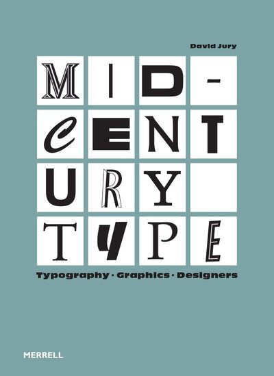
MID-CENTURY TYPE
- Authors: By (author) JURY DAVID
- Publishers: MERRELL
- Date of Publication: 2023-11-01
- Pages: 240
- Dimensions: 204mm x 278mm
“Mid-Century Type” is a fascinating visual exploration of how,
In the middle of the last century, the typographer became a contributor
independent and influential in a world of technological communication in
rapid development. At the end of World War II, designers
were first recognised as having a vital role to play
in rebuilding economies, infrastructure and morale
population, but typography remained a vague and largely
unknown. This perception changed radically between 1945 and 1965, a period of
exceptional creativity. Photocomposition and offset lithography have
merged to allow color reproduction, which had the effect
to significantly increase sales of all printed materials, but
especially books and magazines. Technological advances allow
Title sequences of movies and TV shows become more
longer and more sophisticated. As the possibilities for movement multiply,
the design of highway and airport traffic signs has
required typographic expertise. All this attracted typographers into
newly established specialist areas in print media and
the screen. Finally, the cultural value of the typographer's work could be
assimilated to that of the artist, the poet, the author and the director of
films. Mid-Century Type traces the meteoric rise of the typographer during
of the first decades of the post-war period. Each chapter is devoted to a
special design activity in which typography played a role
important, whether it is character design, identity
business, advertising, film or television. David's text
Jury, accompanied by more than 500 illustrations, offers new insight into the
innovative work by a large number of European and American typographers.
Share

