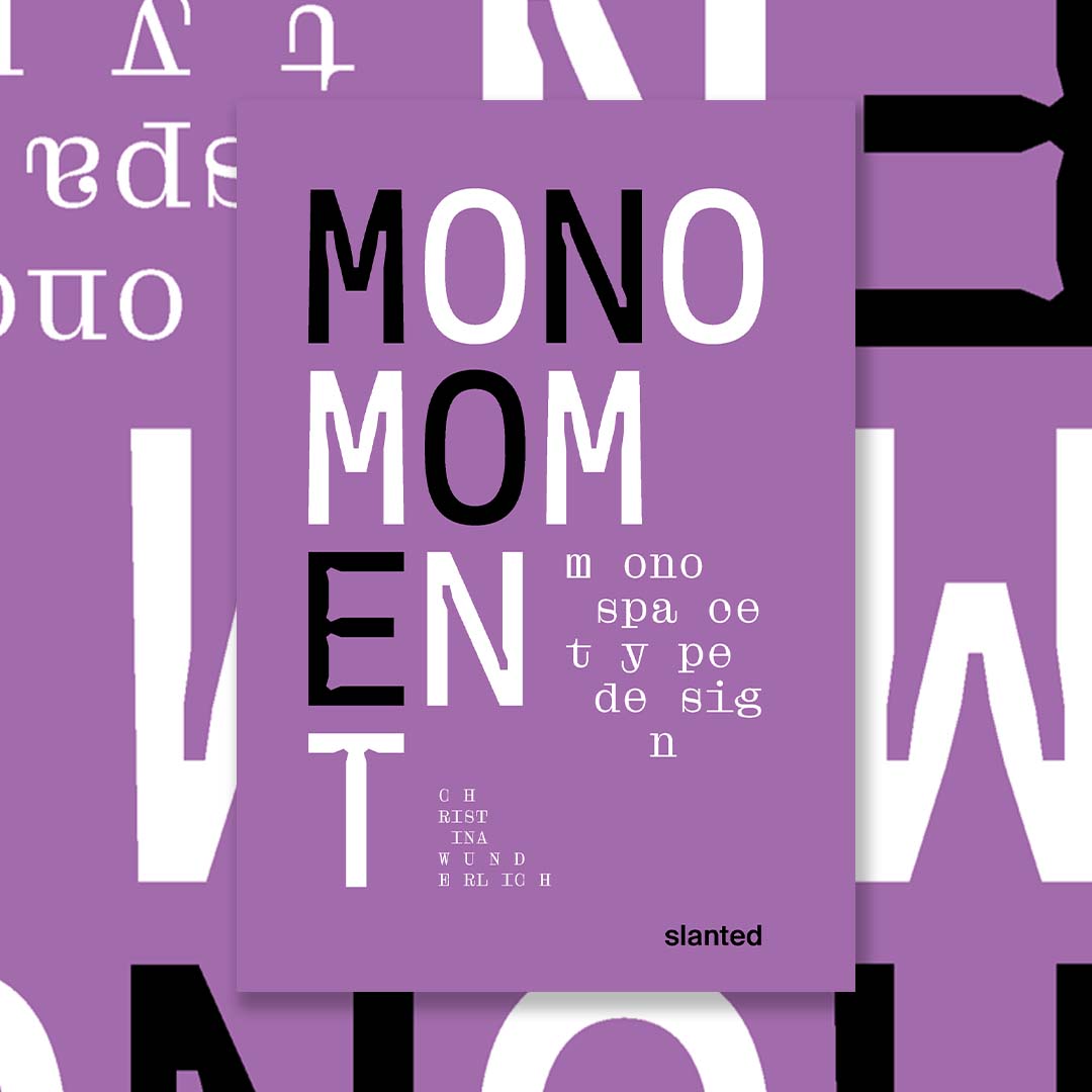
Mono moment — monospace type design
- Authors: De (auteur) Christina Wunderlich
- Publishers: SLANTED
- Language: EN
- Design: Christina Wunderlich
- Date of Publication: 2022-05-11
- Pages: 208
- Dimensions: 245mm x 155mm
Mono Moment—Minivan Type Design
\n
\nMonospace fonts are fascinating! Mono Moment is aimed at type designers, typographers and designers, but also at people who are approaching type design for the first time. The publication thus becomes a reference work and a source of inspiration!
\n
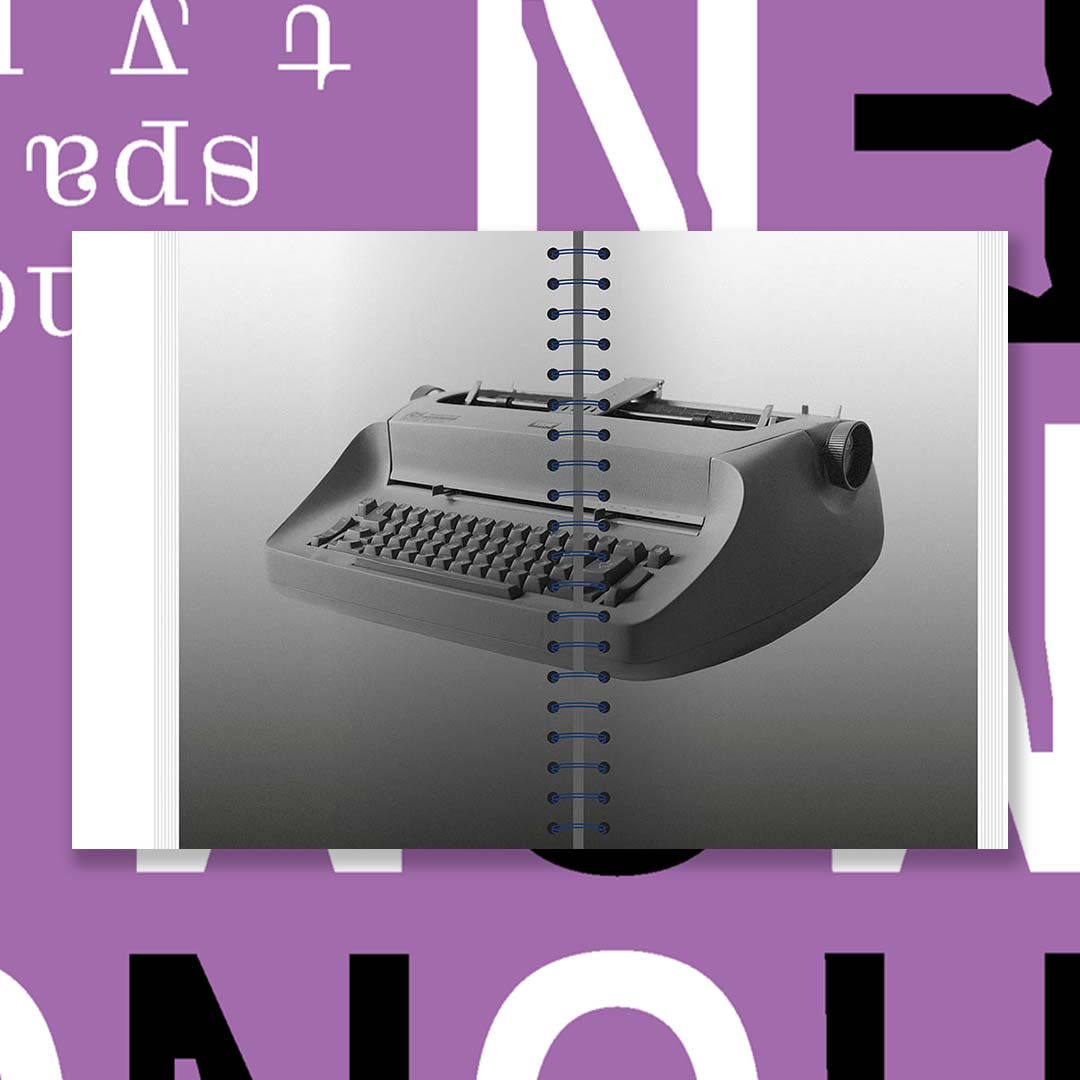
\nFriedrich Nietzsche was probably one of the first to experience the aesthetic appeal of monospecific characters. Ever since he started writing with a typewriter, characters and punctuation have been important to him. In the meantime, we regularly encounter monospecific characters in everyday life: in design and art, in coding, on tax documents or on our identity card. If you look closely, you will encounter non-proportional characters more often than you might expect.
\n
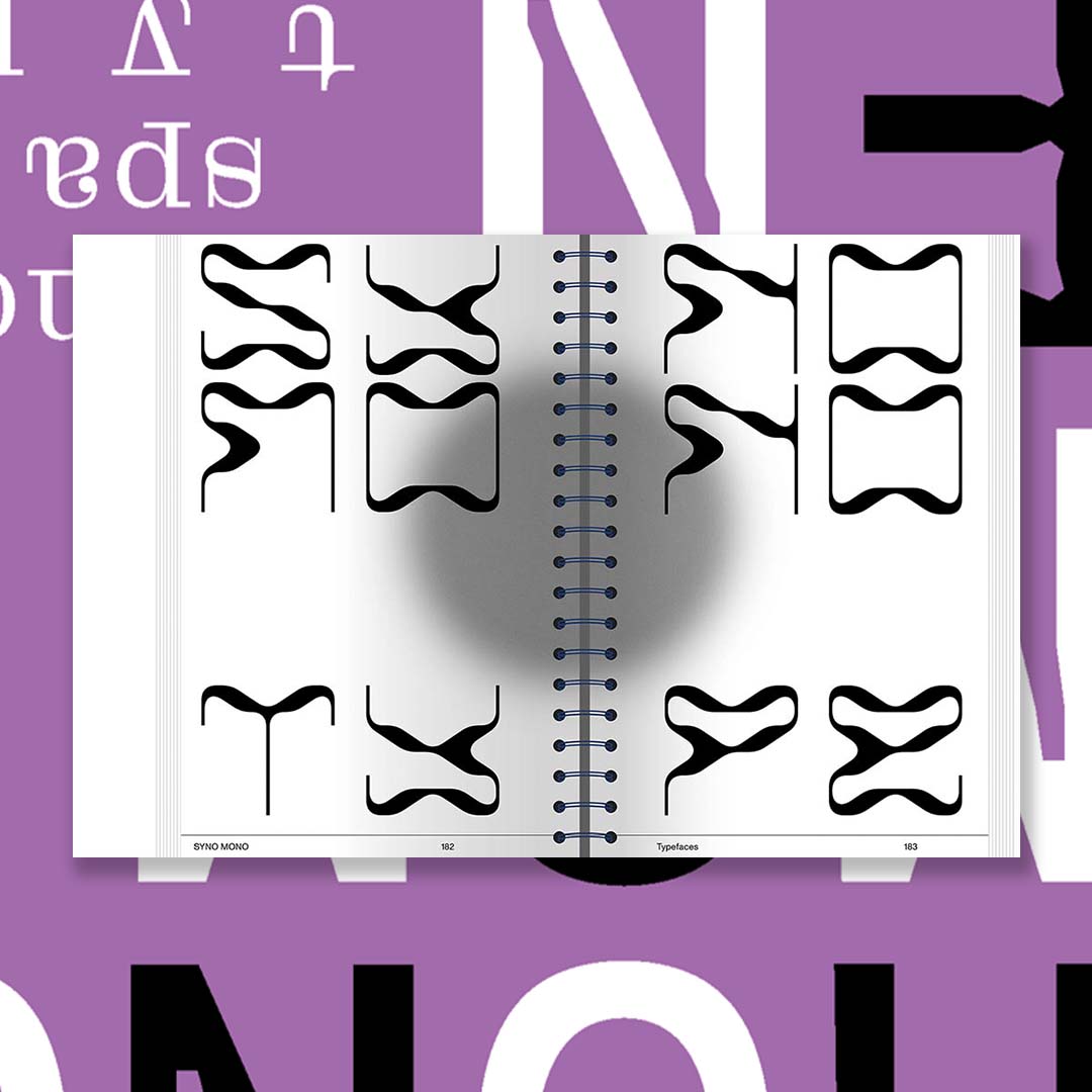
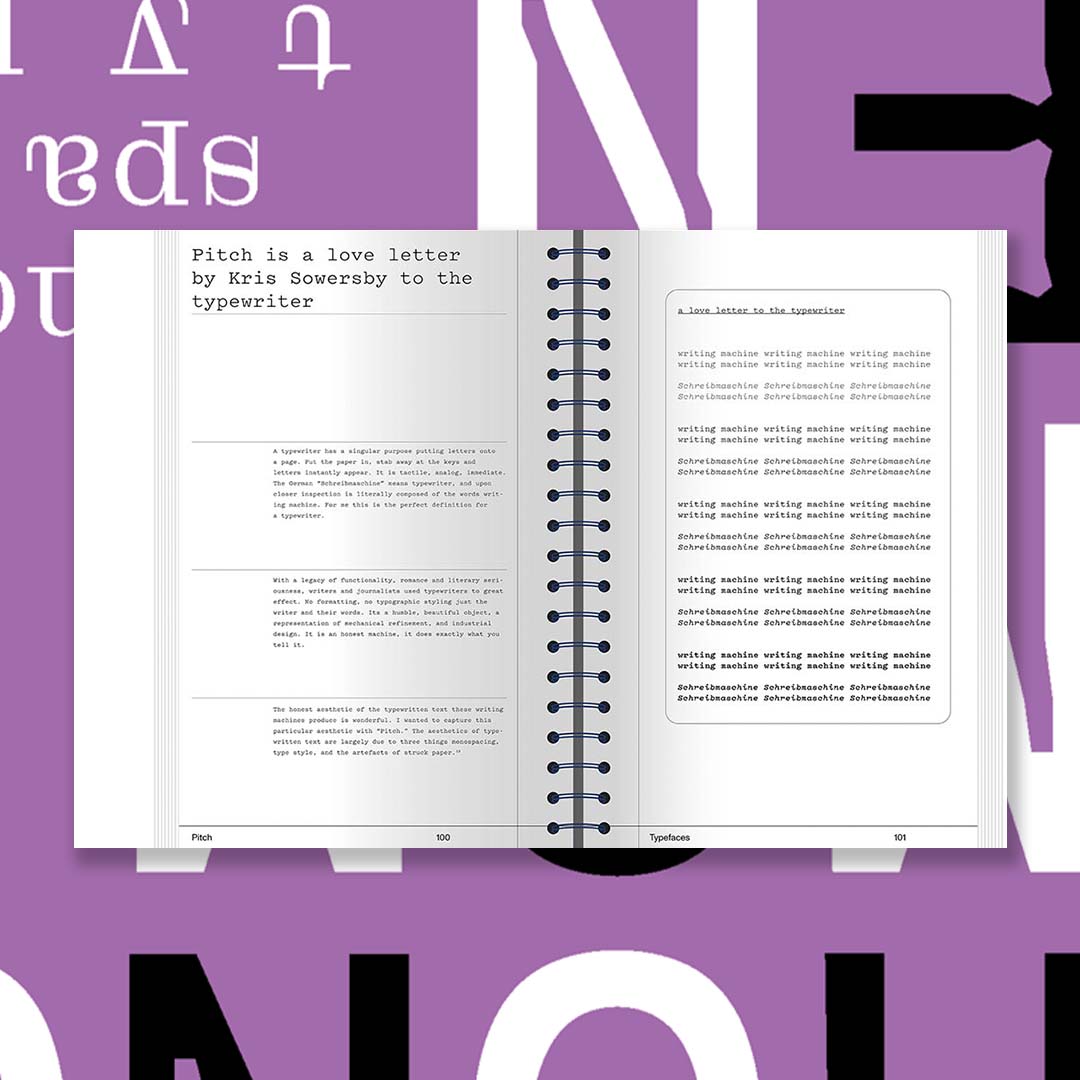
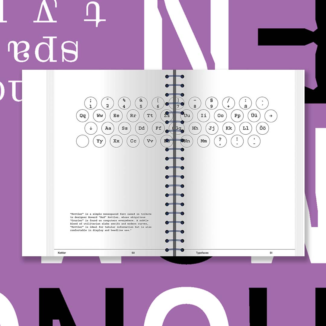
\nMonospecific typefaces are defined by their fixed and equal width for all characters. Each character, letter and number occupies the same space horizontally and vertically. Proportional typefaces, on the other hand, have harmoniously balanced spaces with variable widths between their characters. The widths are not fixed proportionally. This is why monospecific typefaces are also called non-proportional. What exactly is the appeal of typefaces whose letters and characters each occupy an equally sized space?
\n
\nDue to the increase in typeface production in recent decades, almost every well-developed font family also has a mono or semi-mono cut. When searching for the word "monospace" on the World Wide Web, one finds countless entries in addition to results such as "I am looking for a beautiful monospace font", "Top Ten Monospace Fonts" or "Best Monospace Fonts for Coding". In an age where it has never been easier to design and publish typefaces, this book is a good orientation towards monospace!
Share
