Christina Wunderlich
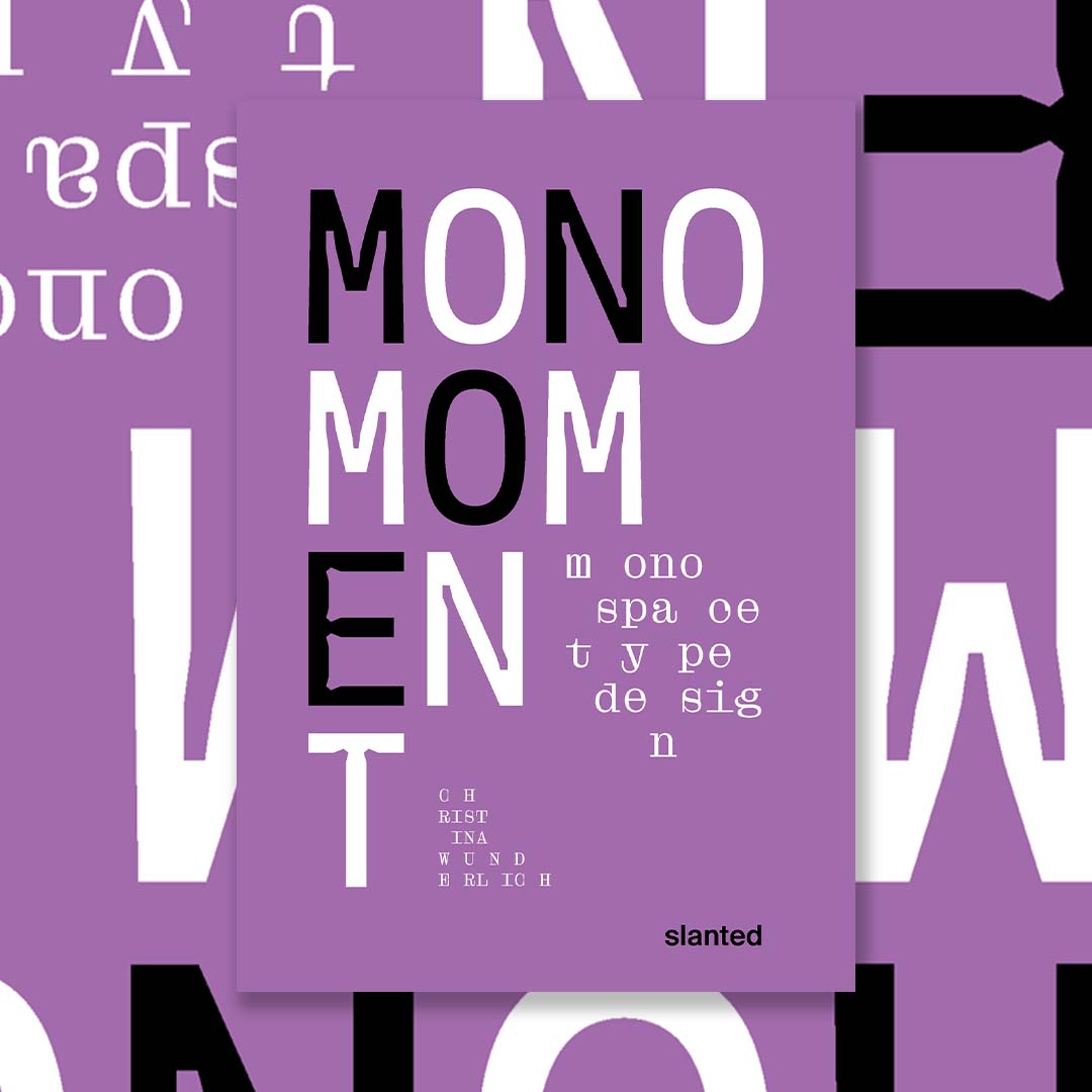
Mono Moment—Monospace Type Design
23,50€
Only 1 left in stock
Only 1 left in stock
Mono Moment—Monospace Type Design
Monospaced fonts are fascinating! Mono Moment is aimed at type designers typographers and designers, but also at people who are dealing with type design for the first time. The publication thus becomes a reference book and source of inspiration!
Friedrich Nietzsche was probably one of the first to feel the aesthetic appeal of monospaced typefaces. Since he started writing with a typewriter, typefaces, and punctuation have been important to him. In the meantime, we encounter monospaced typefaces regularly in everyday life: in design and in art, in coding, on tax records, or on our ID. f you take a closer look, you will encounter non-proportional typefaces more often than expected.
Monospaced typefaces are defined by their fixed, equal width for all characters. Every character, letter, and number occupies horizontally and vertically the same space. Proportional typefaces, in turn, have harmoniously balanced spaces with variable widths between their characters. The widths are not set proportional. That is why monospaced typefaces are also named non-proportional. What exactly is the attraction of typefaces, whose letters and characters each occupy an equally large space?
Due to the increase in typeface production over the past few decades, almost every well-developed font family also has a mono or semi-mono cut. When searching for the word “monospace” on the World Wide Web, countless entries can be found in addition to the results such as “I am looking for a beautiful monospaced font,” “Top Ten Monospace Fonts,” or “Best Monospace Fonts for Coding.” At a time when it has never been easier to design and publish typefaces, this book provides a good orientation to monospace!
you may also like
out of stock
Leben und tod
out of stock
Triste Tropique – Topographies of Sadness
out of stock
Gordon Parks: The Atmosphere of Crime, 1957
out of stock
From Latin America
